
Design through the Decades | The 1990’s
Graphic design in the 1990s was heavily influenced by the spread of the Internet and the birth of websites. Web design then was simple and straightforward. It’s rough around the edges, but it functions the way it’s supposed to, even though it’s somewhat naive when seen today. Tables served as the foundation of every site, but their usage limited creativity, so web design was boring but allowed information to be displayed clearly. Times New Roman was the default font for long lines of text. Moreover, there was an ultra-colorful yet chaotic backgrounds for sites featuring prehistoric gifs.
Design Purpose
Over the last 20 years, there’s been a lot of changes in the field of graphic design. Today, the focus is on usability, templates, and an attractive visual language for visitors, but during the 1990s, it was all about frivolity and superstructures. There was “brutalism” in the aesthetic, which is neither easy to navigate nor visually appealing but is an honest and raw look. The 1990s was one of the least subtle eras in graphic design history. It was during this time that Photoshop 1.0 (exclusively for Macintosh) was created, and thus, graphic design was never the same again.
The 1990s is popular for its imagination in music, fashion, film, TV, and even technology. The entire decade was powerfully evocative, whether it be TV ads, posters, logos, or even advertisements in glossy magazines. Graphic design played a critical role in encapsulating the “feel” of the 1990s.

Design Style
There was a new musical genre that emerged at the end of the 1980s. It was called “acid house," and by the 1990s, it quickly spread around the globe. The term “rave” emerged as a subculture around the acid house movement, and it was played everywhere from clubs to warehouses even if it was illegal to do so. The only way to promote these events, other than word-of-mouth, was through flyers and invitations. As a result, a new style that was spontaneous and eschewed was developed. Typography was bold with block letters. It was designed as such so that it could be legible and readable even if you’re under the influence of drugs or alcohol. Colours were gaudy, while backgrounds were dark and gloomy. Science fiction and surrealism inspired the patterns that were used.
Influentical People
Graphic design in the 1990s had a style on its own, but it also involved inspirations from the past. It was all about learning about the fundamentals of the craft and figuring out which rules you can bend. In the spirit of standing on the shoulders of giants, here are influential artists of the 1990s who changed the game with their iconic works and significant contribution to graphic design.
Chip Kidd

Bridges to Babylon - The Rolling Stones Stefan Sagmeister
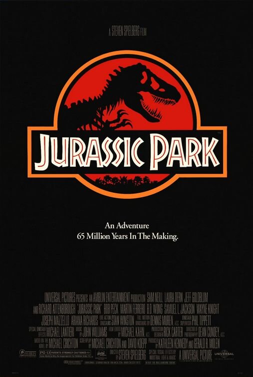
Chip Kidd is best known for his eye-catching book jackets for writers such as James Elroy, Michael Crichton, and Neil Gaiman (among many others). Jurassic Park is one of his most popular book covers. It was so famous that it even became the logo in the film and for the park itself. The Jurassic Park T-Rex is one of the most recognisable logos of the 1990s.
Stefan Sagmeister
Austrian-born Stefan Sagmeister rose to prominence in the early 90s and is well-known in the field of graphic design due to his work in the music industry. He has created conceptual artwork for the likes of Lou Reed and The Rolling Stones.

Paula Scher, Bring in’Da Noise, Bring in’Da Funk ad campaign for The Public Theater, 1995–96. Courtesy of Pentagram.
Paula Scher
Paula Scher is probably one of the most famous female graphic designers in the world. Not only is she famous for her design work, but she is also known for overhauling theatre promotion standards and setting a new norm. Scher gave a fresh identity to institutions such as the New York City Ballet, Metropolitan Opera, The Public Theater, and the New York Shakespeare Festival. She also served as the first female principal at Pentagram, which she joined in 1991.
Jonathan Barnbrook
Jonathan Barnbrook is famous not only because he is David Bowie’s latter-career go-to designer, but also because of his best known influential type design – Exocet. It has been the most pirated font on the web shortly after release in 1991. Moreover, Exocet is also the type used in the video game, Diablo.

Exocet Typeface, Designed by Jonathan Barnbrook, 1991.