Designer Series | Rob Janoff
“The apple logo creator”
In a world where the battle for attention keeps getting steeper and steeper, design becomes the deciding variable. How should you capture your audience within a few seconds? How do you ensure that you can captivate them without being too overwhelming? Rob Janoff answers this in three words. Simpler is better.

Rob Janoff
Widely known as the creator of the Apple logo, Rob Janoff is an American graphic designer born and raised in Culver City, California. He obtained his degree from San Jose State University with a Major in Industrial Design. Later, however, he realised that this was not the area of study for him, so he focused on graphic design. It's a good thing that some things just aren't meant to be because, due to that shift in interest, we now have one of the world's most iconic logos.
Early works and the creation of the Apple Logo
Janoff worked for many small Silicon Valley agencies in his early years as a graphic designer. However, it was in 1977 when he landed a job at Regis McKenna that he was chosen to design the corporate identity package for Apple Computer. Why? His creative director knew how hard he worked for his tech clients. He knew that Janoff listened to his clients and researched as much information about their business or product.
This made him the most suitable candidate for Apple.
Back then, nobody knew or even guessed how successful Apple Computers would be today. Even Regis McKenna, Janoff's boss, himself focused on his cash flow and ignored the twenty percent stake offer of Apple. But Janoff erased all preconceptions he had about what his client should be doing and really listened. He listened to Steve Jobs and his vision for a friendly, yet formal logo for Apple.
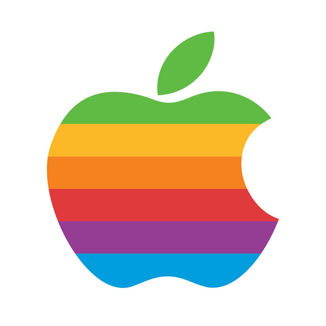
Thus, Janoff's vibrant, rainbow Apple logo was born.
Janoff's logo helped translate the complex idea of a home computer to a more approachable and straightforward reality. And up to this day, even with several revisions, the basic outline of his logo remains.
His Philosophy
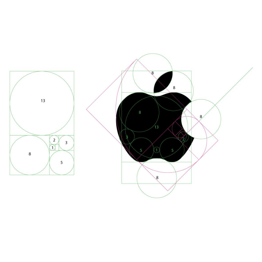
"Whatever you're doing, keep it simple." This is one of the core principles that Rob Janoff lives by. He believes that people can't remember complicated things, so you must opt for memorable, simple things. That's what will make your logo stand out. That's how you make your mark.
There may be so many things that you want to add to your design to make it pop up and be significant. However, "meaningful" doesn't have to translate as "complicated" in your logo. People like what's easy to understand, so you need to strive for a clear message in your logo that is singular and impressive.
More than that, Janoff believes that "you also need to strive for a wink in the logo. You remember a joke or something that made you laugh. Any time you can add any kind of humour it becomes more likable and memorable. If you're so afraid to give a wink, then you're going to be pretty much beige like everything else. Especially in the age of the Internet."
Recent Works
York City and Chicago, where he designed print, TV advertising, and branding for many national and international clients.
Over the last years, he has devoted himself to a digital agency with his Australian business partner, Joel Bohm. Together, they produced work for a diverse range of clients, like Crooz, a gaming company in Japan and Pluit City in Indonesia. He was also instrumental in Dropbox's rebranding in 2017 and Instagram's new logo in 2016, which sparked lengthy arguments among designers and casual observers alike.
More recently, Janoff's agency has collaborated with strategic partners like Fiverr in New York to create branding outcomes for premiere companies. He is also a prolific speaker who has delivered keynote addresses and masterclasses in design for numerous universities and academic facilities around the world.
Truly, you can never underestimate the power and influence of simple things. Most often than not, simplicity lasts the test of time.